 |
|
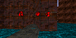
The example in the upper left shows what happens when adjacent wall textures have similar light intensities. As you can see, it's difficult to perceive the corners of walls, relative distances or even the shape of the space you're looking at.
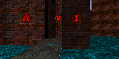
By giving the adjacent textures differing light intensities, suddenly, edges of the walls are apparent, and the little walkway behind the column is visible. It's also helpful to darken the floor textures so the bottom of the walls are more obvious, and it's more apparent where a player can explore or escape to, which here mainly depends on whether one has fired on the Mother of All Hunters or not.
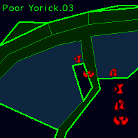
Notice also that we've darkened the narrow strip of wall visible to the right of the column, so the player is already getting some idea about the geometry beyond the walkway. Here the water, the landscape texture, and the darker strip all give information about the shape of things to come.
Often our use of differential shading doesn't follow the laws of nature. Here, the two walls facing the player should have the same light intensity, but we've ignored it for better gameplay. Hastur's a big fan of gameplay, and he doesn't really enjoy the real world much.
|


