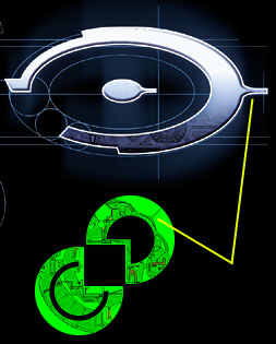
Note the spur that extends from the 'O'in the Halo logo and a similar spur extending from the Jjaro space station in the background of the Jjaro logo.
Thanks to David Johnston <de.johnston@sympatico.ca>.
Concerning the above submission Chris Hebner <chebner@erinet.com> sent
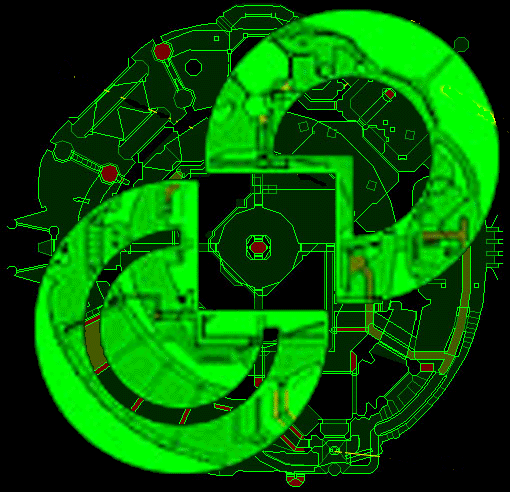
in a pic showing the Jjaro logo overlaid
over the full Jjaro space station. Note how the end of the spur is cut off in logo
thus excluding the round part at the end. This would seem to counter any suggestion
that the 'O' Halo logo was designed to look like part of a Jjaro space station. Unless
of course the inspiration came from the Jjaro logo directly and not the space station.
Chris goes onto to say:
There could still be an interesting correlation between the 2 symbols. The Jjaro uses a map as a backround, the Halo uses a (?wall) texture.
Yes a wall/door texture of a ring motif.